YouTube
A subscription-grouping feature for YouTube
Overview
Youtube offers a wide variety of content, and the subscription section is a great way for users to keep track of the creators they enjoy seeing most. However, users are flooded with such large amounts of streaming content that it can be difficult for them to find the videos they want to watch.
Background
Create a feature to help users find what they want to watch more easily, while staying consistent with YouTube’s branding and UI.
Objectives
Research
Testing
Product Design
My Role
Team
Self-directed, with feedback from my mentor and peers
Research
How do YouTube users interact with their subscribed content and channels?
How and when do people use YouTube?
Are there any friction points or frustrations that users have with YouTube?
My research focused on understanding how users interact with subscriptions, but also included the wider context of YouTube usage.
Specifically:
Goals
I studied the ways major video streaming services organized their content, as well as a Chrome plugin that modifies the YouTube interface. I noted how the services work, what features are included, and their strengths/weaknesses.
Market Research
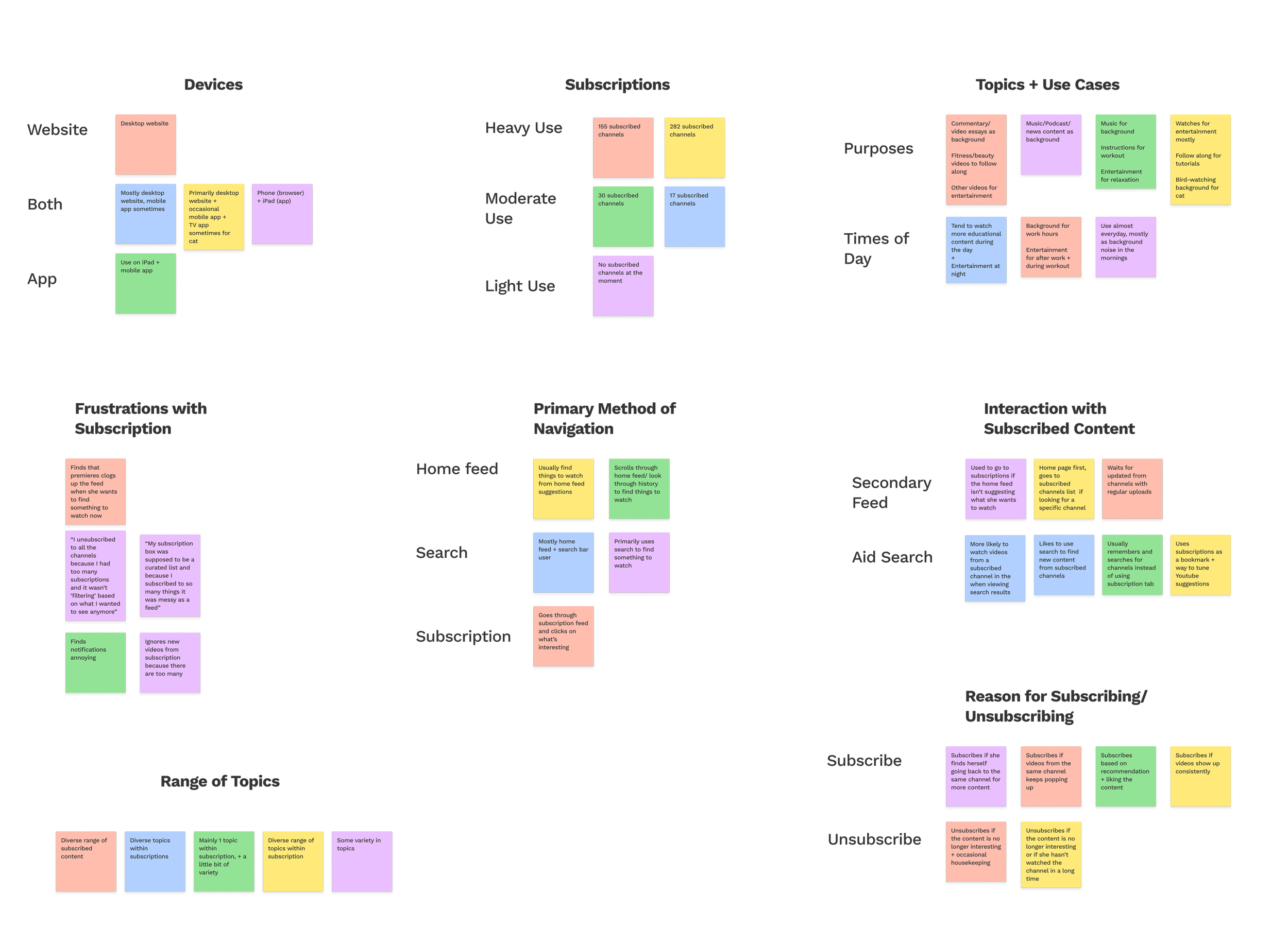
I reached out to five people of varied ages and genders who use Youtube regularly.
User Interviews
Heavy users find their subscription feeds to be messy and overwhelming, making it difficult for them to find the content they want to watch.
Other users skip using the subscription feature all together, since they find searching to be faster and easier than navigating through subscriptions.
Research Synopsis
Define
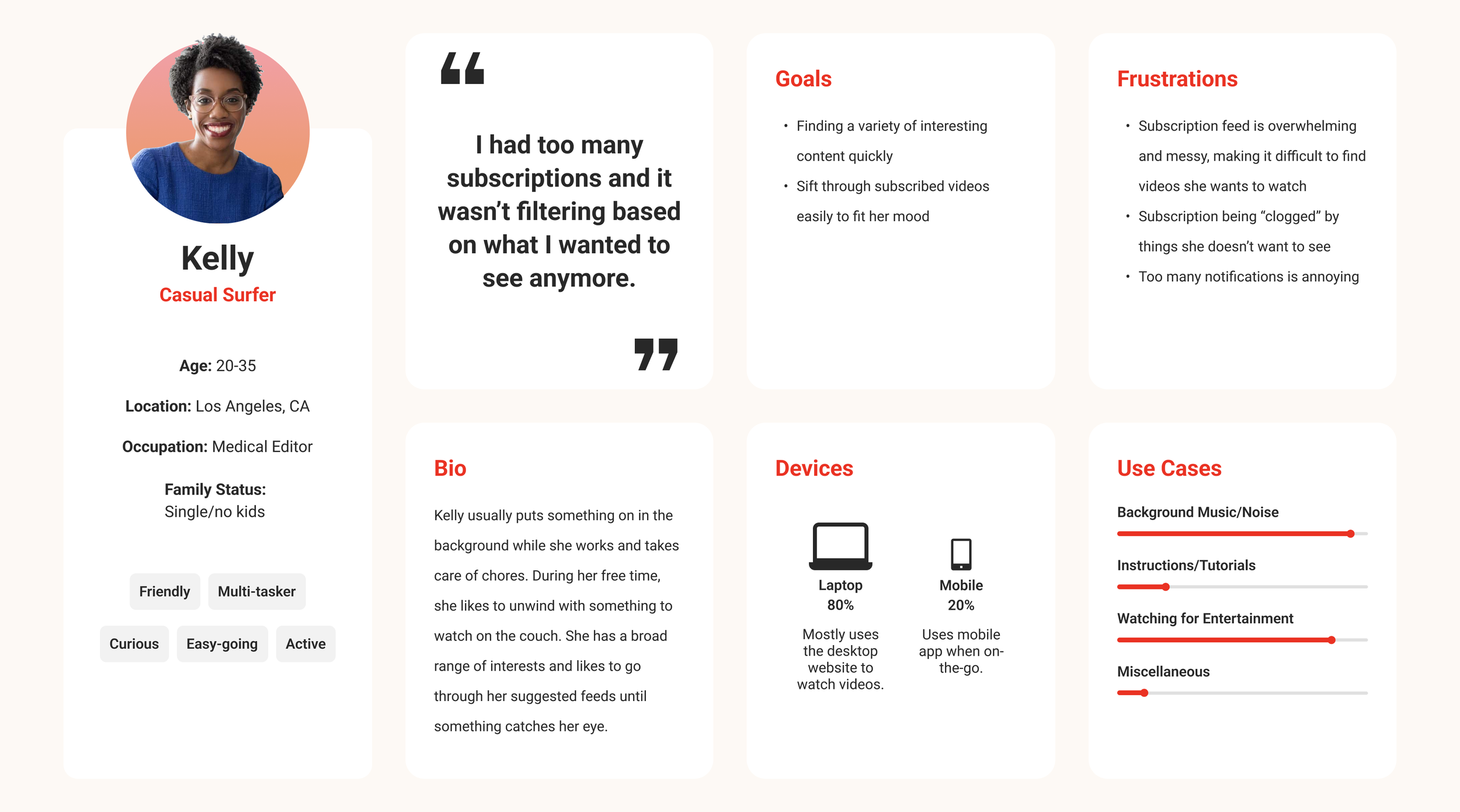
Using the data I gained from research, I developed two user persona to represent high-level goals and frustrations. This helped me clarify and focus on meeting the needs of the most important user groups.
User Personas
How might we help users sort through their subscribed content more easily and intuitively?
How might we empower users to customize their subscription feed?
How might we make using the subscription tab a quick and intuitive experience?
“How might we make users feel confident navigating their subscriptions and customizing their experience?”
Specifically:
How Might We…
Design
I created some flows to think through how users would interact with this feature and identify the key screens that are needed.
Task Flows + User Flows
I started creating the sketches while working on the flows so that I could cross reference the two for the necessary key screens and variations. After iterating several times across the two, the flows and the sketches became a solid foundation for how the feature is to look and function.
Low-fi Sketches
I applied YouTube’s branding and design to the sketches to create high-fidelity wireframes and the prototype, referencing existing UI elements for the new feature so that it feels cohesive with the platform. It was a fun creative exercise to find the balance between optimizing the new feature and staying consistent with the brand, and I ended up tweaking some existing elements to enhance the overall user experience with the addition of the new feature.
High-fi Wireframes + Prototype
Test + Iterate
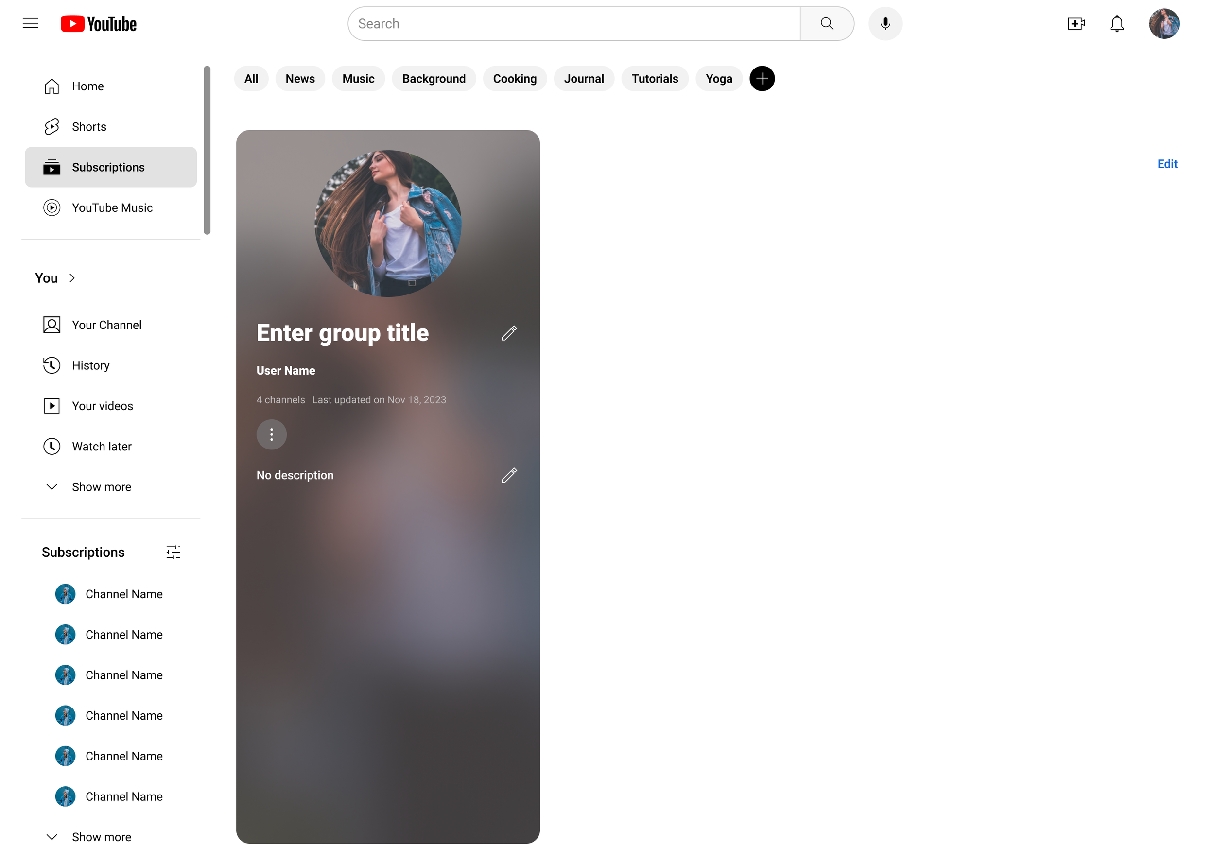
Create a subscription group
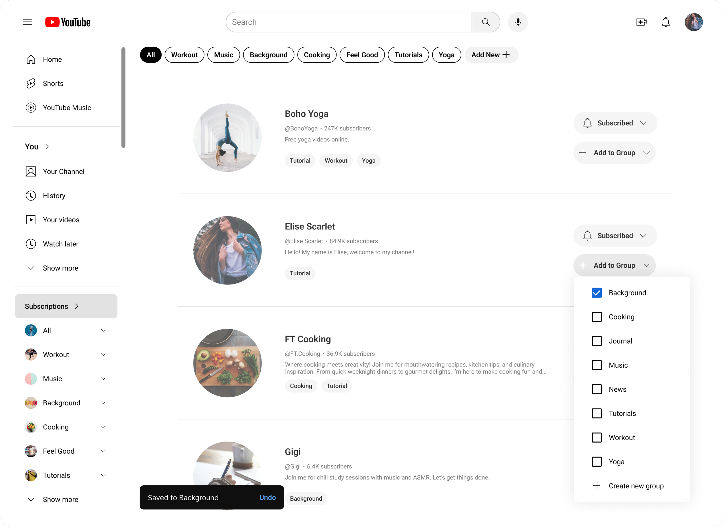
Add a channel to a group
Filter subscription feed
Filter list of subscribed channels
I conducted 3 moderated tests to observe how users interact with the new feature, focusing on 4 flows:
Usability Testing
The tests produced some varied opinions as well as many alternative pathways for completing the chosen tasks. While the test participants agreed that the UI feels familiar and very consistent with the existing design, they felt that some of the components didn’t give enough affordance to be immediately noticed when looking to complete a task. To address these issues, I created several more iterations of the prototype to experiment with possible solutions, eventually producing the final MVP.
Test Results + Iterations
Users expressed difficulty finding the add group button, so I added some text for more discoverability and affordance.
There were also some confusion about whether the chips are user controlled, so I updated the styling of these group chips to distinguish them from the auto-generated ones on the YouTube home feed.
Updated Chips
Before
After
When adding a channel to groups, users were unsure whether their selection has been saved.
To address this, I added a toast so that users receive feedback from their selection.
Toast Added
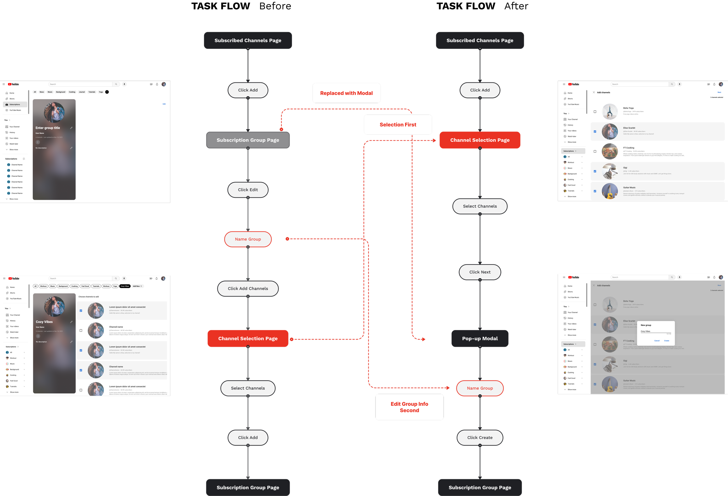
Users had a hard time finding the edit button on the create group screen and were unable to continue to the next step. At first, I tried to resolve this issue by changing the UI and making the CTA more prominent.
Reworked Creation Flow
V.1
V.2
But upon further reflection, I realized there was a wider experience issue taking place. So I went back to reference YouTube’s existing patterns and reimagined the sequence of screens and actions. The result was a group creation flow that is not only more intuitive and familiar to the user, but also allows the task to be completed in fewer steps.
Feature Overview
The tabs and chips at the top of the subscription page allow users to customize their feed. The tabs offer the option of filtering by commonly used categories/order, while the chips correspond to user-created groups of channels for any theme they choose.
Filter Subscription Feed
The list of subscribed channels in the left nav bar is replaced with a list of groups, which allows users to find a specific channel quickly under their created groups. For a full list as it currently exists on YouTube, the “All” tab shows all the channels the user is subscribed to.
Group Channels
Going to “Manage” now allows users to create groups from the channels they are subscribed to. The groups will then appear as chips at the top and in the navbar on the left.
Create Groups
Users can also add a channels to multiple groups simultaneously through the “Add to Group” button.
Add a Channel to a Group
Results
Since this was a self-directed project, I was unable to get more extensive feedback and data. However, in a business setting I would monitor the following metrics to measure success:
Number of groups created would be the simplest measure to see if users choose to adopt this feature after its release. In addition, task success rates should be high and error rates low for this feature to be considered successful.
Groups Created
A shorter time elapsed between when a user goes to the subscription page and when they start watching a video would be another indicator that this feature is successful in helping users find what they want to watch more easily.
Time Elapsed Before Watching
A lower bounce rate from the subscription page would indicate that the addition of this feature improves user experience with subscribed content.
Bounce Rate
Future Possibilities + Ideas
Help users to customize their subscription feeds further by allowing multi-selection for the group chips. This would enable users to narrow in on a specific intersection of content, for example, “Workout” videos that are also “Feel Good”.
Multi-select
Add a fun visual touch to groups by allowing users to personalize group covers with an icon/emoji library. This could help users differentiate their groups more easily, as well as add more visual distinction between the user-generated group chips and the auto-generated chips on the homepage.
Icon-library
Reorganize the navigation in the left bar so that related tabs are placed closer together. This does not fall under the scope of this project, but I received multiple comments about the nav bar being confusing during testing. I moved the subscription tab next to the list of subscribed channels to address the issues related to this feature, but I think it could be a beneficial to consider a more extensive reorganization with more time and resources.
New Sidebar Organization
Final Thoughts
With the final prototype, I believe I have met the goals outlined at the beginning of the design process. As an avid YouTube user, this feature is something I would love to have, and I’m quite happy with the results.
I found this project to be a great exercise for working within stylistic constraints and adding on to an existing product. It was fun to get creative with possible interactions while making sure that everything aligned with original look and feel of YouTube.


