Delta
A reimagined flight-booking experience
Overview
Delta is one of the most popular airlines in the United States, and has a fully-functional website to match—however, there are opportunities to improve the user experience across devices.
Background
Reimagine the searching, booking, and online check-in user experiences across devices.
Objectives
Research
Product Design
Testing
My Role
Team
Self-directed, with feedback from my mentor and peers
Research
I wanted to understand how users interact with the Delta website so that I could identify ways to streamline their experiences. Specifically, I focused on:
Goals
What do users look for when choosing an airline?
How do users search and book their air travel (devices, purposes, etc)?
What are users’ needs and use cases for airline websites?
Are there any friction points or frustrations users experience when accessing airline websites (across devices)?
I compared a few competing airlines in the U.S. as well as some third-party travel booking websites. I noted how the services work, the features included on the websites, and their strengths/weaknesses.
Market Research
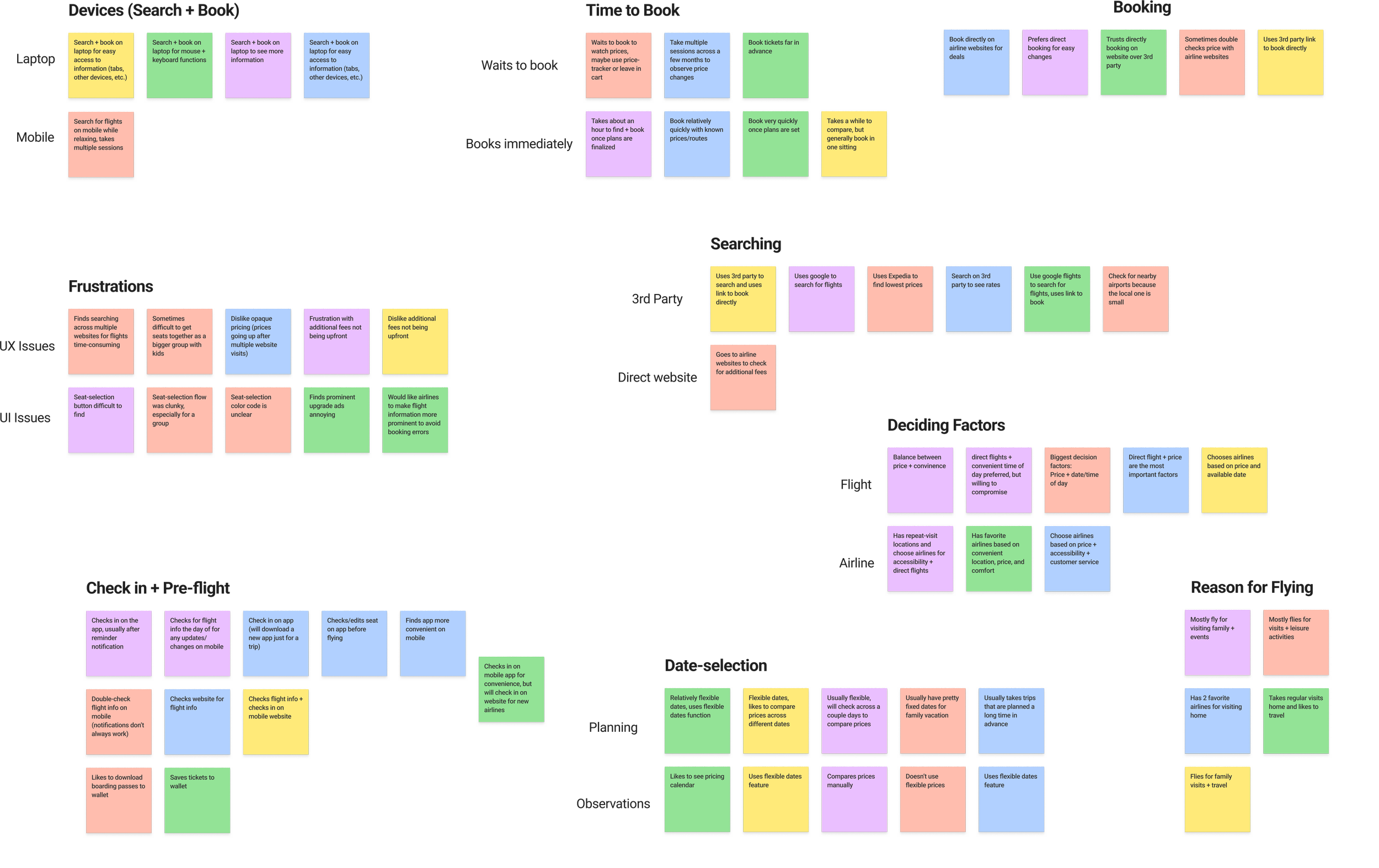
To further learn about user needs and challenges, I conducted moderated interviews with five people with different lifestyles and travel habits. As a part of the interviews, I asked the users to go through the search and book process on the Delta website to see what they think about the current experience.
User Interviews
Users are frustrated with opaque pricing and hidden fees
Users find the search and book process to be time-consuming
While most users tend to go through the booking process relatively quickly, they usually start searching and comparing flights far in advance of both booking and the trip
A variety of factors affect a user’s choice of flight, but most agree that it is a balance between price and time/date
Most users choose to search and book on desktop websites for the convenience of multiple windows, but tend to check in on their mobile devices
Research Synopsis
Define
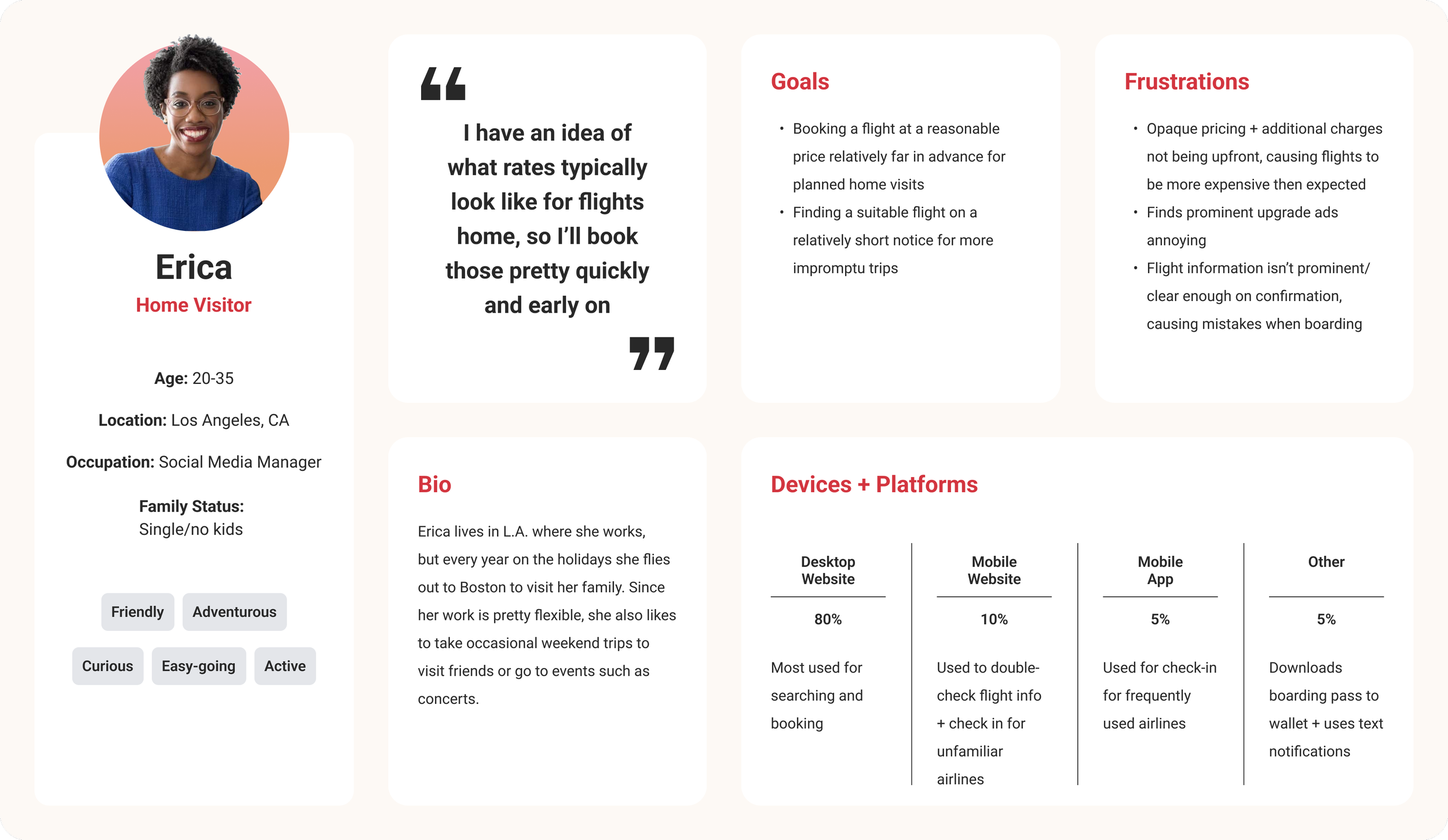
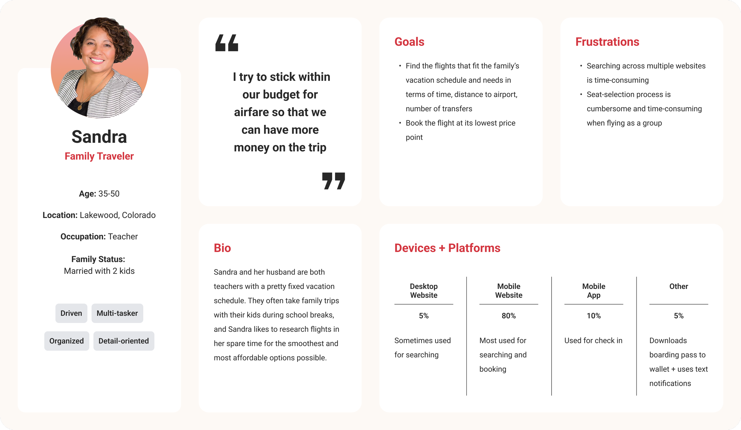
Using the data I gained from research, I developed two user persona to represent two different sets of goals and frustrations. This helped me clarify and focus on meeting the needs of the most important user groups.
User Personas
“How might we reduce the amount of time, effort, and mental exertion required for users to find and book their ideal flights?”
Specifically:
How Might We…
How might we help users complete their tasks in fewer clicks/steps?
How might we make the search and book process more linear? (Reduce the number of searches and the use of the back button)
How might we present all of the relevant information in a clearer and more digestible way?
How might we empower users to customize their search experience to fit their needs?
Design
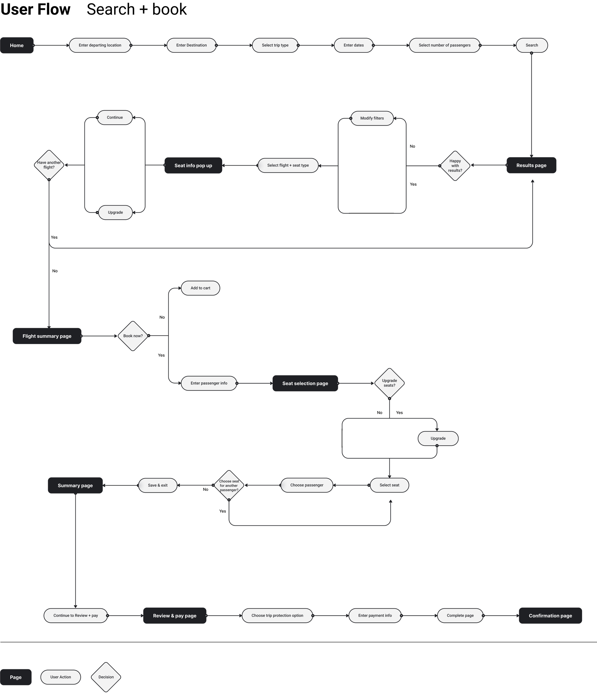
Given the large amount of information and possible pathways on the screens, I created some flows to think through how users would interact with elements on the page and identify the key screens/components that are needed.
User Flows
I started creating the sketches in tandem with the flows so that I could cross reference the two for the necessary key screens and navigation. After iterating several times across the two, the flows and the sketches became a solid foundation for how the feature should look and function.
Low-fi Sketches
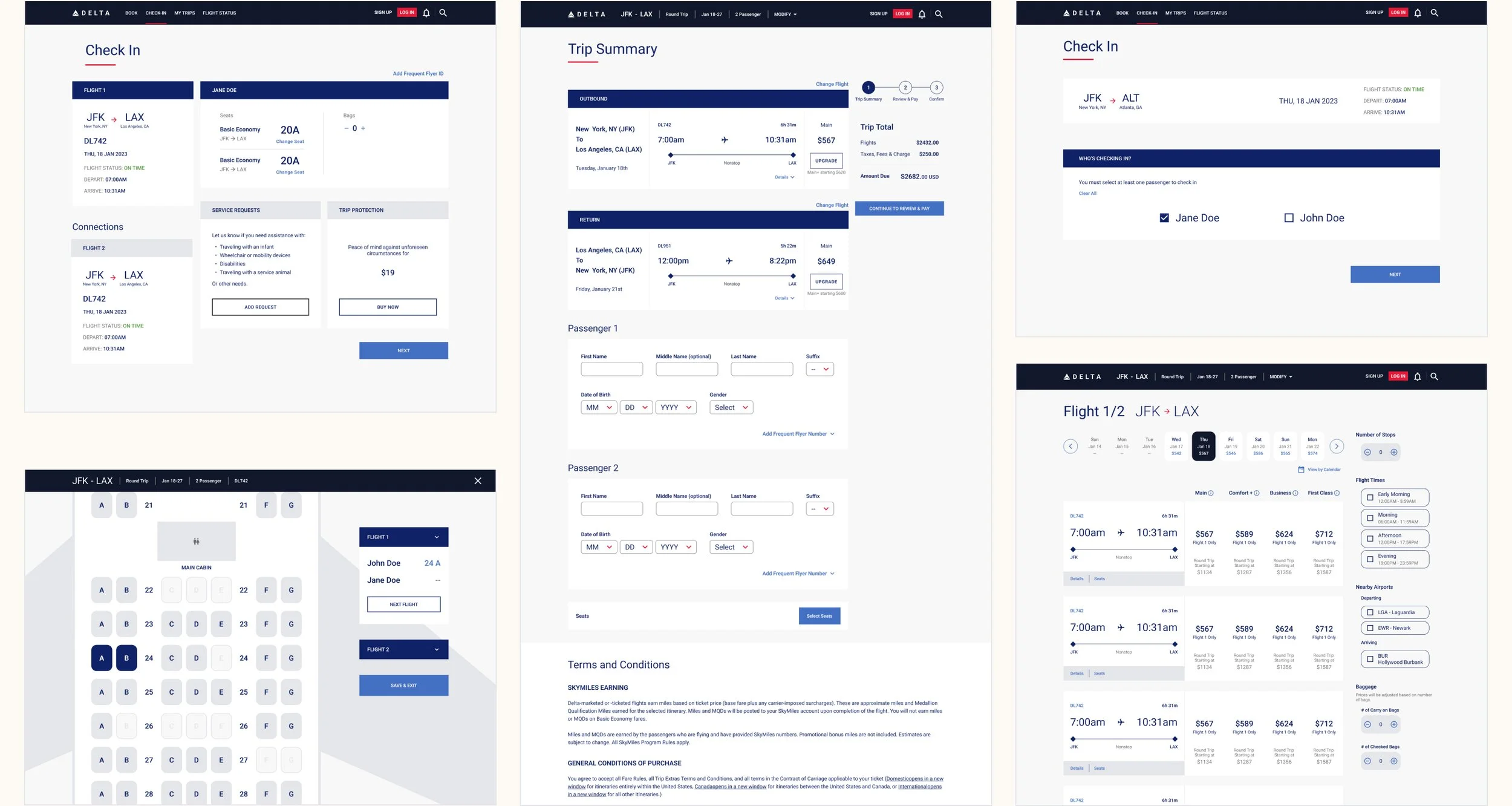
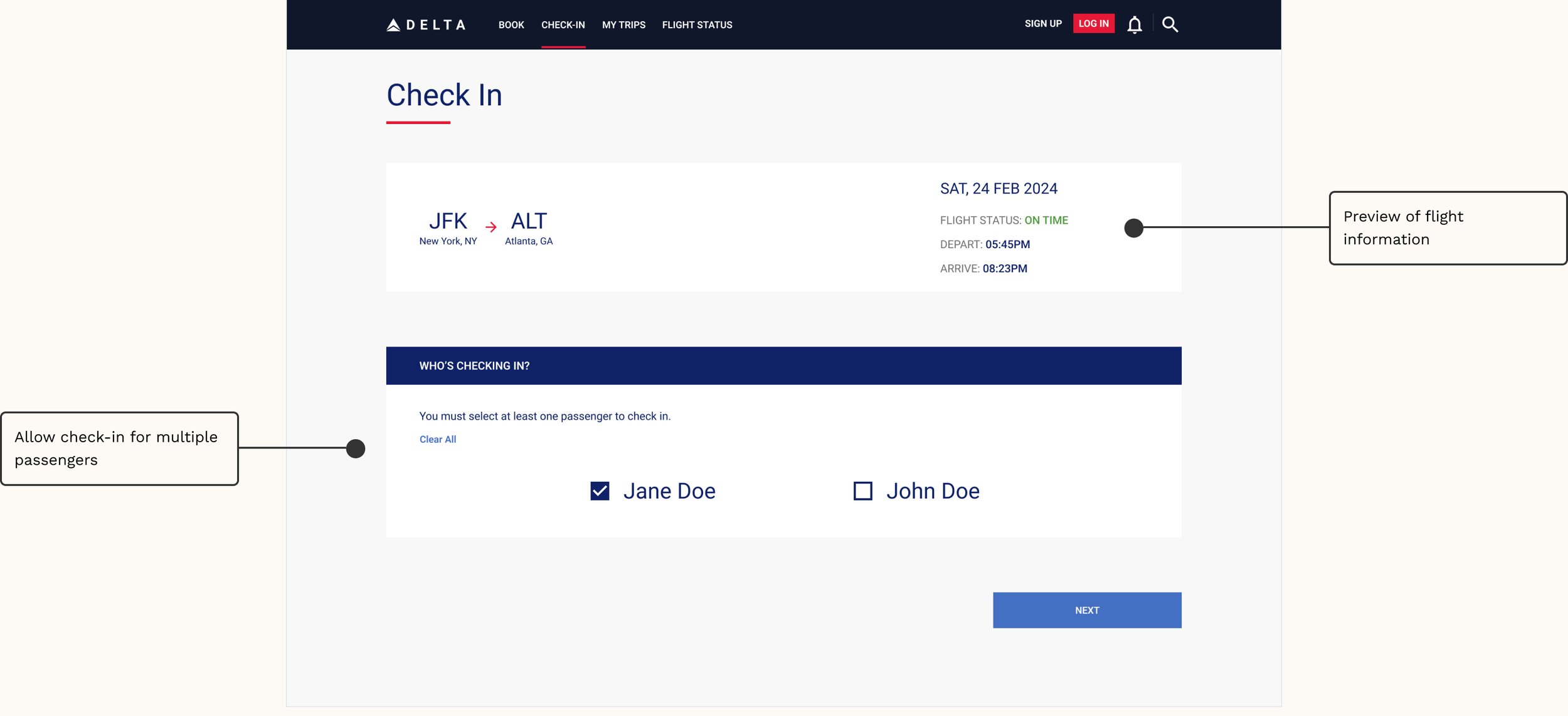
With the base structure in place, I began building out the screens into high-fidelity wireframes. For this stage I mainly worked on the desktop versions of the screens so that I’m including the full range of features.
High-fi Wireframes + Prototype
Test
I conducted unmoderated tests with six participants to observe how users interact with the desktop screens.
Usability Testing
Responses to the tests were overall positive, with the participants rating the screens at an average of 8.5 on a scale of 1 to 10 (1 being very confusing and difficult to use, 10 being very easy and intuitive to use). While the test participants agreed that the screens felt organized and the experience was intuitive, there were some minor confusion about the styling/wording of a few of the elements.
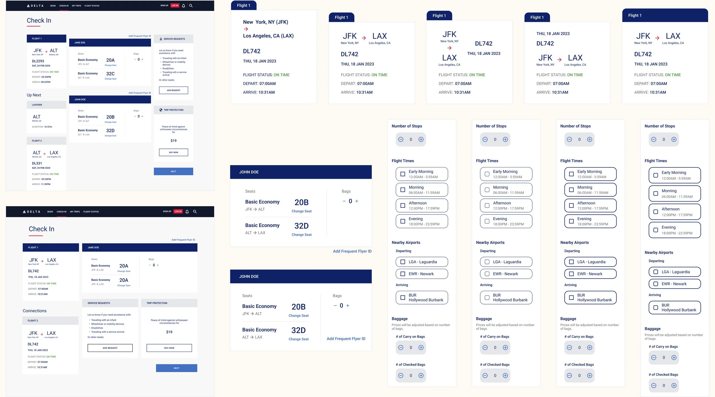
To address these issues, I created several more iterations of the screens to experiment with possible solutions, eventually producing the final MVP.
Test Results + Iterations
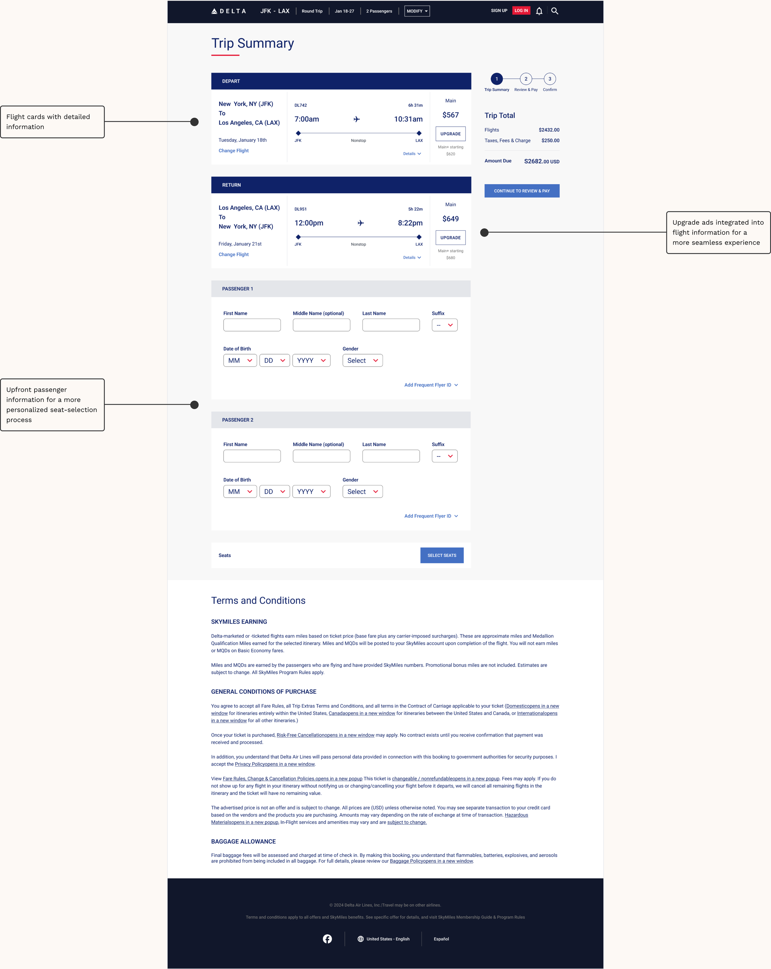
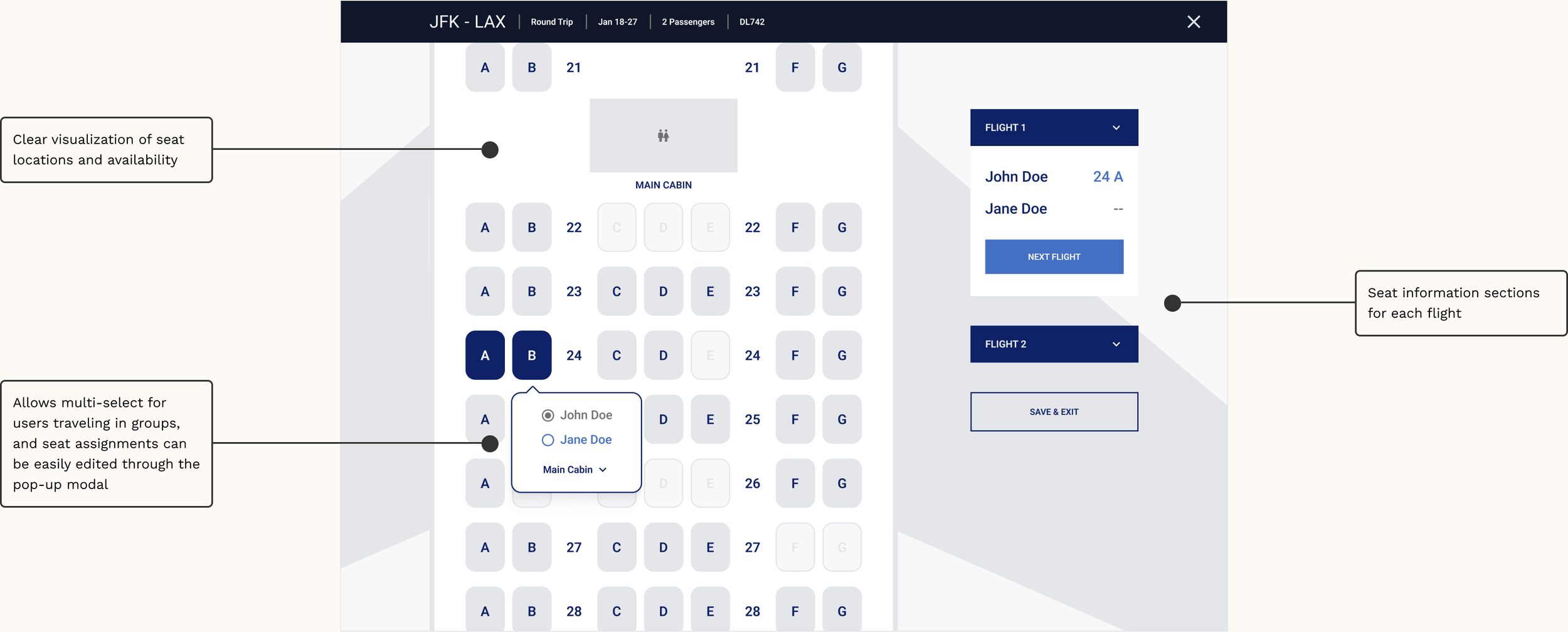
Final Screens
I tried to achieve a balance with the visual styling so that the elements optimized for a better experience are still consistent with Delta’s branding.
Desktop Screens
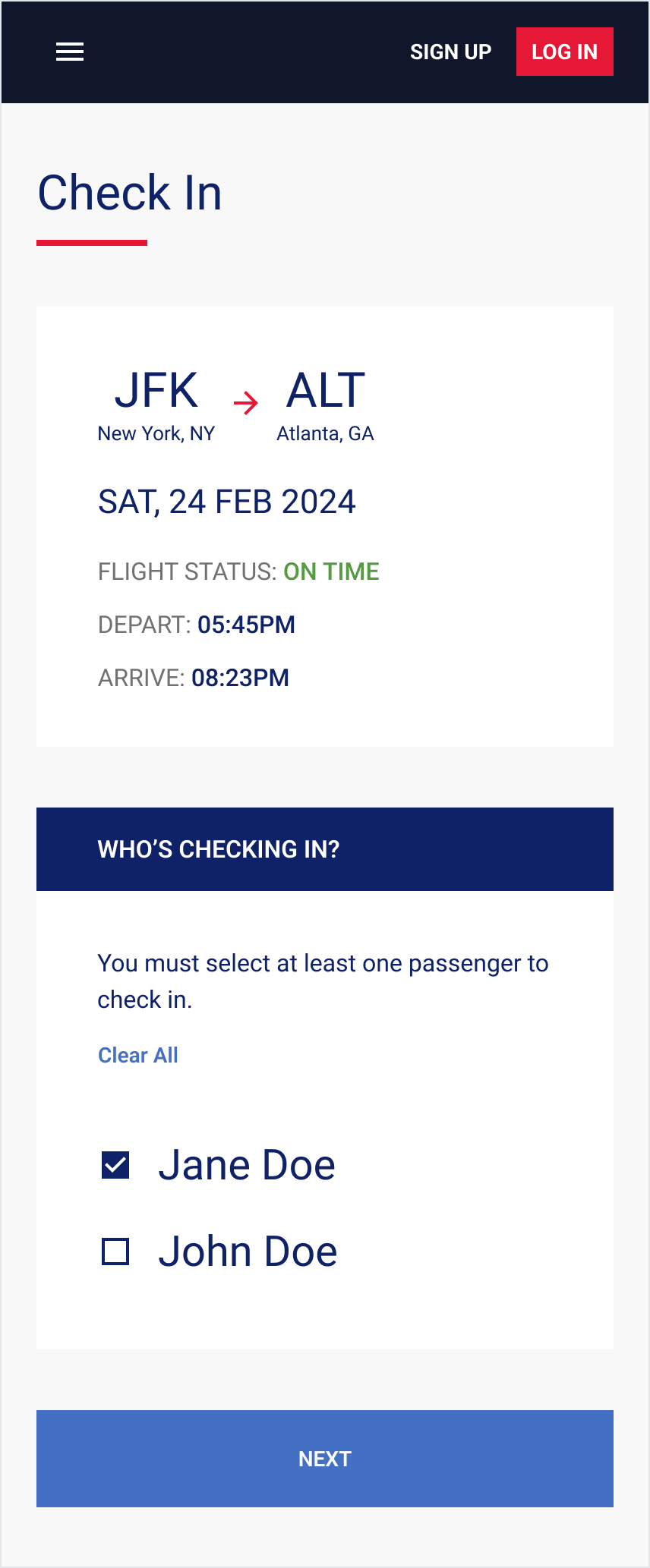
Once the desktop screens were in good shape, I adapted them to mobile with all the iterative changes. Given the time constraints, I focused on the online check-in flow since users most frequently go through this process on mobile.
Mobile Screens
Results
Since this was a self-directed project, I was unable to get more extensive feedback and data. However, in a business setting I would monitor the following metrics to measure success:
Less time on task would be an indicator that users are navigating the site and completing their tasks more easily and efficiently.
Time on Task
Fewer searches and fewer use of the back button before booking would indicate that users are able to get the information they need in the linear task flow.
Searches + Back Button
A lower error rate and bounce rate would indicate that the reimagined flow improves the user experience with searching and booking.
Error Rate + Bounce Rate
Final Thoughts
I found this project quite challenging, mainly due to the large amounts of information and components on each page. However, I think the final screens are a successful attempt at reimagining Delta’s existing flows and interactions, and I learned a lot by trying to work with all the constraints presented by this project.
If I had more time and resources, I would try to fill out the flows a little more with intermediary screens and micro-interactions. The MVP I created here is a great foundation to build on top of, and I think the addition of those elements could make the experience feel more well-rounded and pleasant.


