Daiie
An all-in-one productivity app for tasks, notes, and habits
Overview
While most people want to work towards a more fulfilling and productive lifestyle, it’s easy to lose sight of that goal in the rush of day-to-day life. Users often scatter information—be it notes, to-dos, or grocery lists—across multiple platforms, leading to the cumbersome task of switching between apps to manage their daily activities.
Background
Create a mobile app that helps users stay accountable and keep track of their productivity and lifestyle goals.
Develop a brand guideline including logo, color palette, and typography.
Objectives
UX Research
Product Design
Branding
My Role
Team
Self-directed, with feedback from my mentor and peers
Research
I wanted to understand how users keep track of their tasks and notes.
Specifically:
Goals
How do users create goals and habits?
What do users use productivity apps for?
Are there any friction points users experience when using those apps?
Are there any challenges users face when trying to document and track their daily activities?
I compared some popular apps on the market that specialized in different aspects of productivity/lifestyle. I took note of their primary functions, the features they included, as well as their strengths/weaknesses.
Market Research
I interviewed five participants with different lifestyles and approaches toward documenting information.
User Interviews
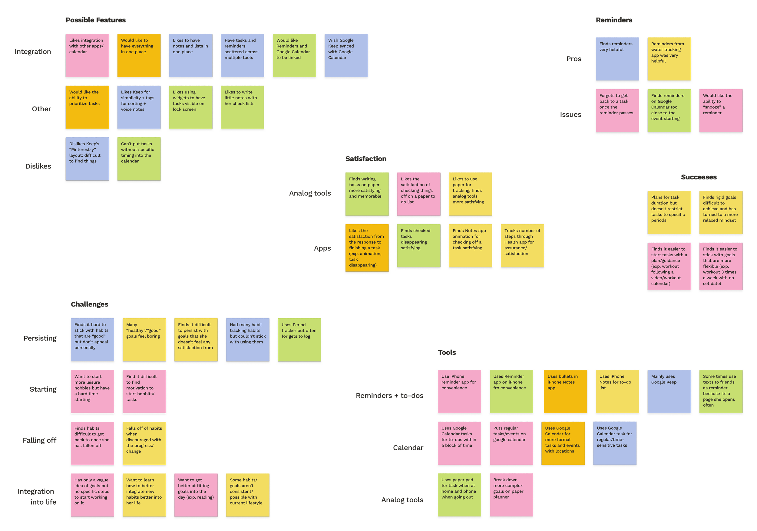
Users highly prefer tools with “satisfying responses” (checking boxes on paper, strikethrough animation on digital tools, etc.)
Most users have separate tools/apps for events, tasks, and notes, but would prefer to keep everything in one place
Users find reminders helpful, but sometimes accidentally ignore or forget to customize them
Users find it difficult to persist with long-term/recurring goals and struggle to integrate them into daily life
Research Synopsis
Define
How might we make tracking and completing tasks more enjoyable?
How might we make tracking habits more engaging and rewarding?
How might we make taking/viewing notes more helpful and accessible?
“How might we make achieving personal growth and productivity goals easier for users?”
Specifically:
How Might We…
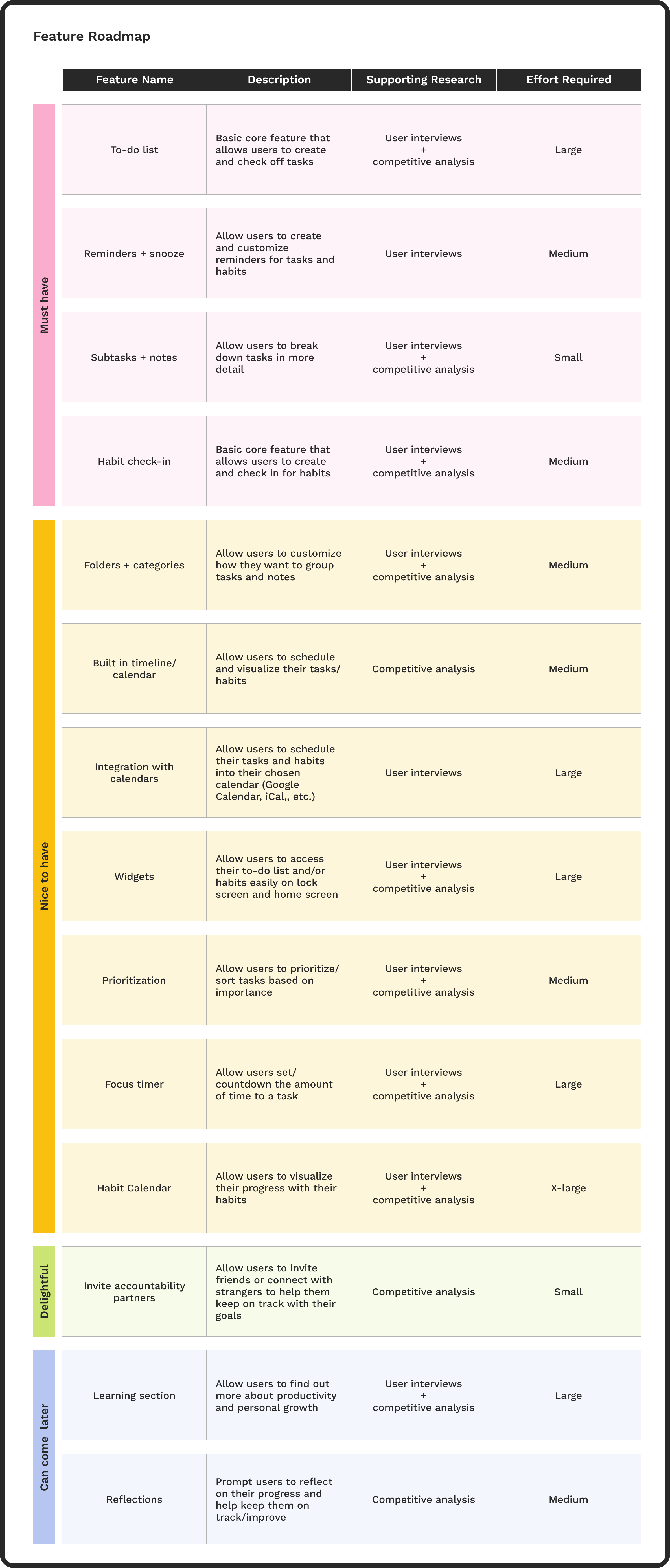
After brainstorming possible features, I sorted the list by priority so I could focus my efforts on the most important features. Given the constraints of this project, I chose to focus on the task-oriented features.
Feature Roadmap
Design Pt.1
I created a site map to think through how the pages should be organized and work out the possible actions that a user could take on each page.
Site Map
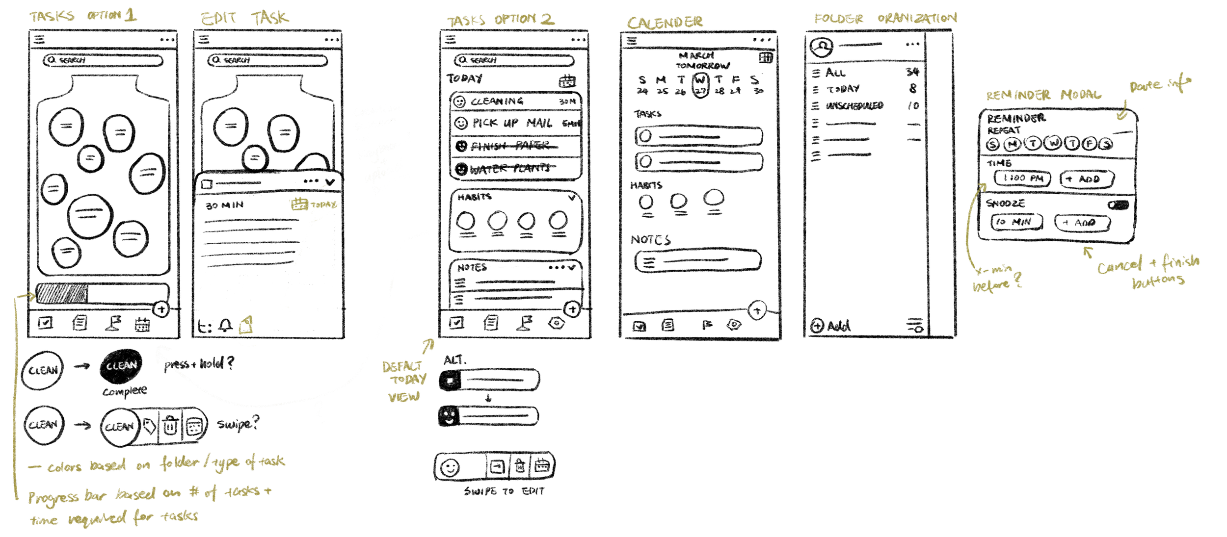
I started creating the sketches while putting together the site map so that I could cross-reference the two for the necessary key screens and navigation. After iterating several times across the two, the site map and the sketches became a solid foundation for the app.
Low-fi Wireframes
Once I’d established the visual direction for the layout, I began digitizing the sketches into mid-fidelity wireframes. I focused on capturing the overall structure and hierarchy of the screens, while also starting to experiment with some fun style elements.
Mid-fi Wireframes
Test & Iterate
I conducted four unmoderated tests to observe how users interact with the basic prototype I built from the mid-fi screens.
Usability Testing
Responses to the tests were overall positive—users liked the design overall and found the flows mostly clear and straightforward.
Test Results + Iterations
“I absolutely love how the UI is put together—everything is clear and at the same time aesthetically pleasing”
“Loved that the tasks are in those blobs—more engaging than a standard timeline”
However, there were also a few issues:
Some users were confused between the reschedule icon and the reminder icon.
To address this, I added a label in the hold state for clarification.
The test participants all agreed that the icons made sense once they understood all the functions, so I would also add an onboarding tutorial in the future to further mitigate any confusion.
Icon Labels for Clarity
Before
After
Users felt uncertain about whether their changes were saved when exiting the task creation page, so I added a save button as a CTA.
Save Button for Clearer CTA
Before
After
Users reported that a few of the elements were difficult to read or easy to miss.
Adding colors in the final product helped resolve some of the issues, but I also increased the contrast in elements such as the add button and the toast to give them more visual prominence.
Contrast Issues Fixed
Before
After
Design Pt.2
With the blueprint of the product in place, I then worked on solidifying the branding and visual aspects of this product. I aimed for a fun, yet sleek and minimal look when assembling the typography, colors, and logos.
Brand Design
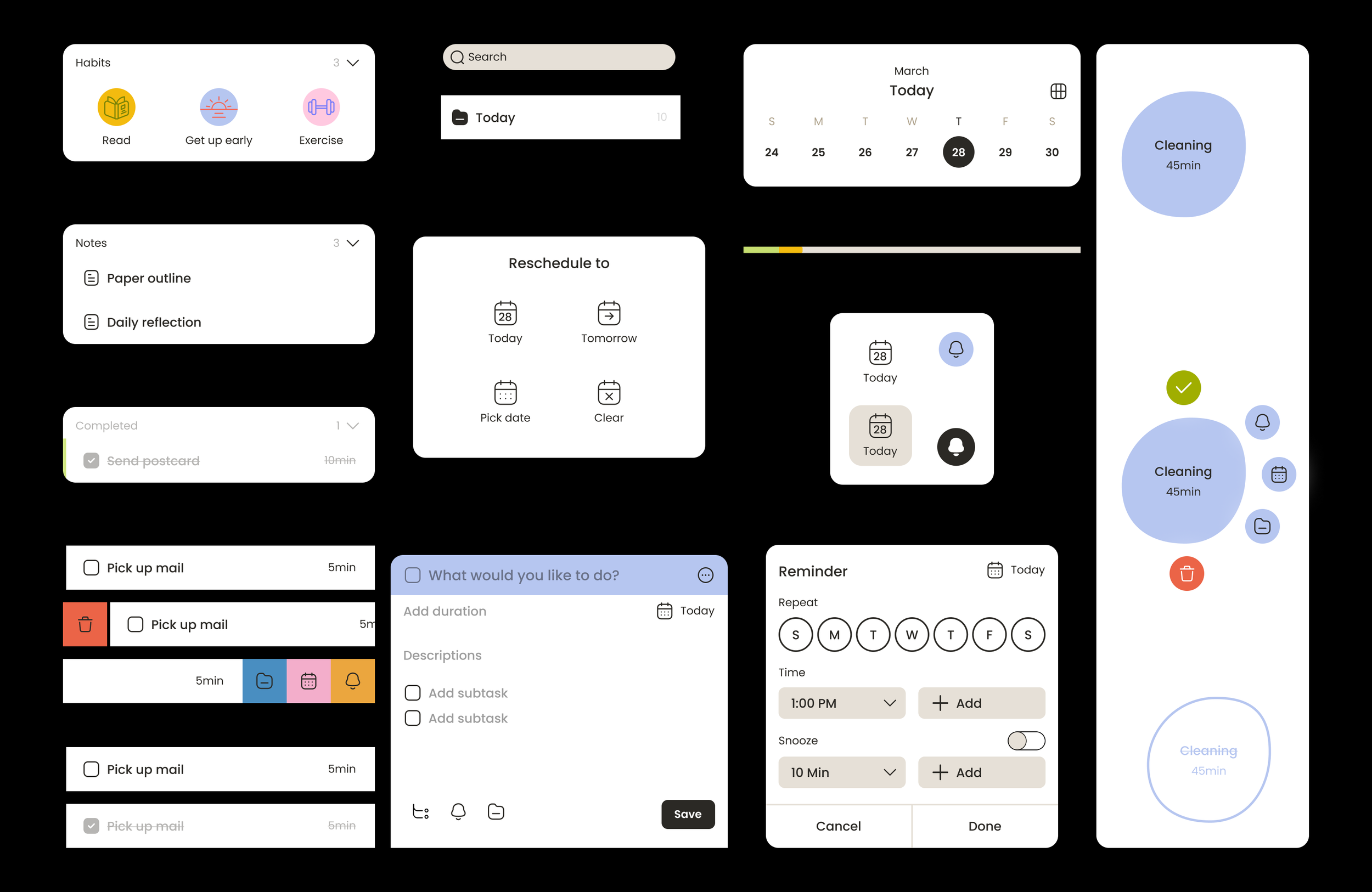
With the visual direction decided, I began pulling out elements of the mid-fi wireframes to apply styling. These components became the building blocks for the final product.
UI Kit
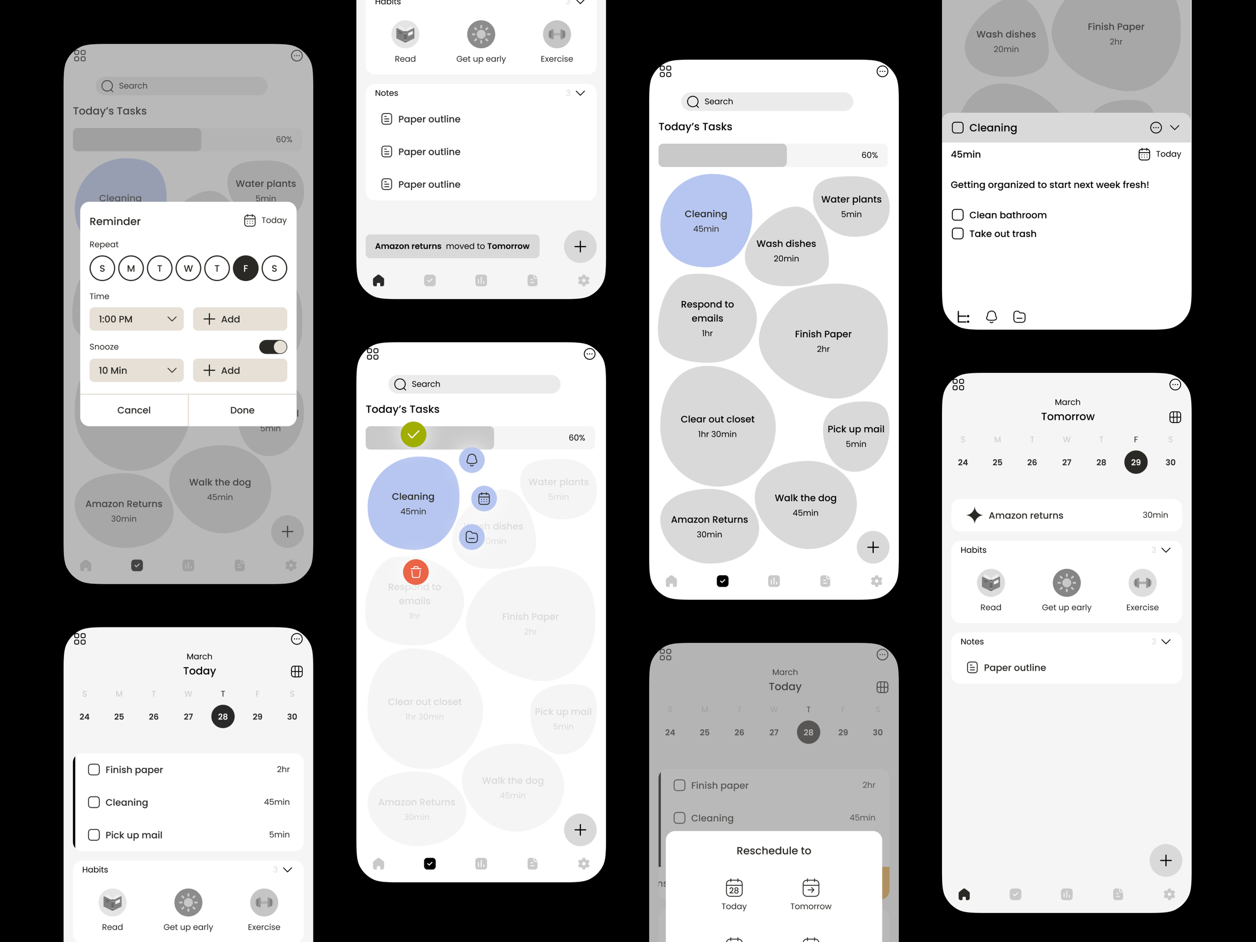
Combining the wireframes, test results, and visual styling, I assembled the high-fidelity wireframes. After some refining of the interactions and a few rounds of iterating, the final MVP was created.
Hi-fi Wireframes
Feature Overview
Users can find all their tasks and notes through the menu, as well as create their own color-coded folders to keep organized.
Folders
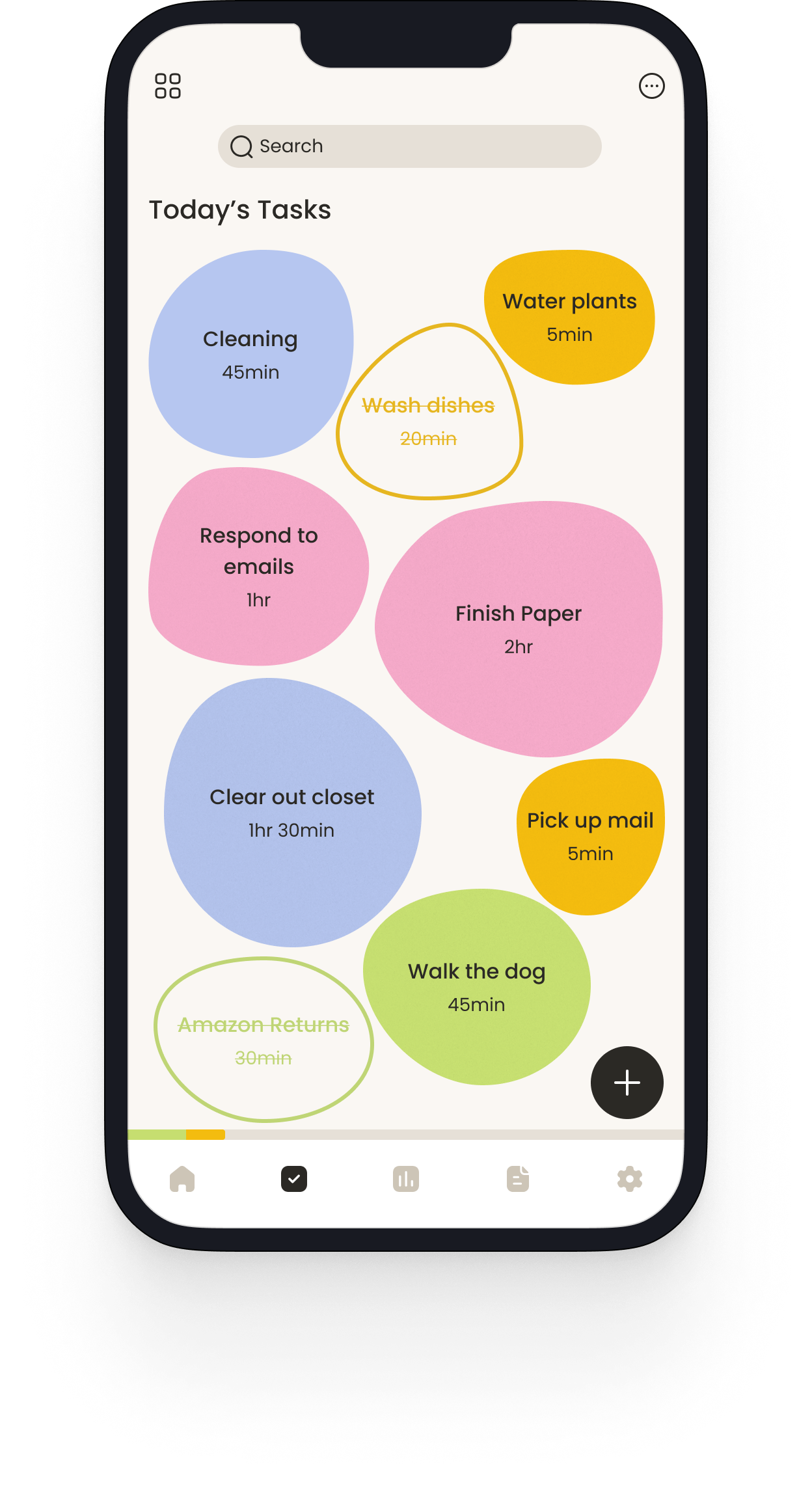
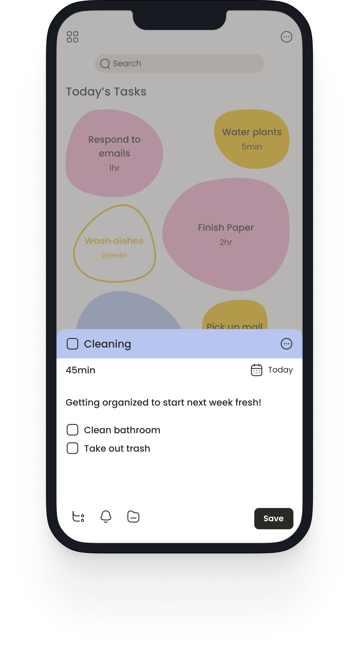
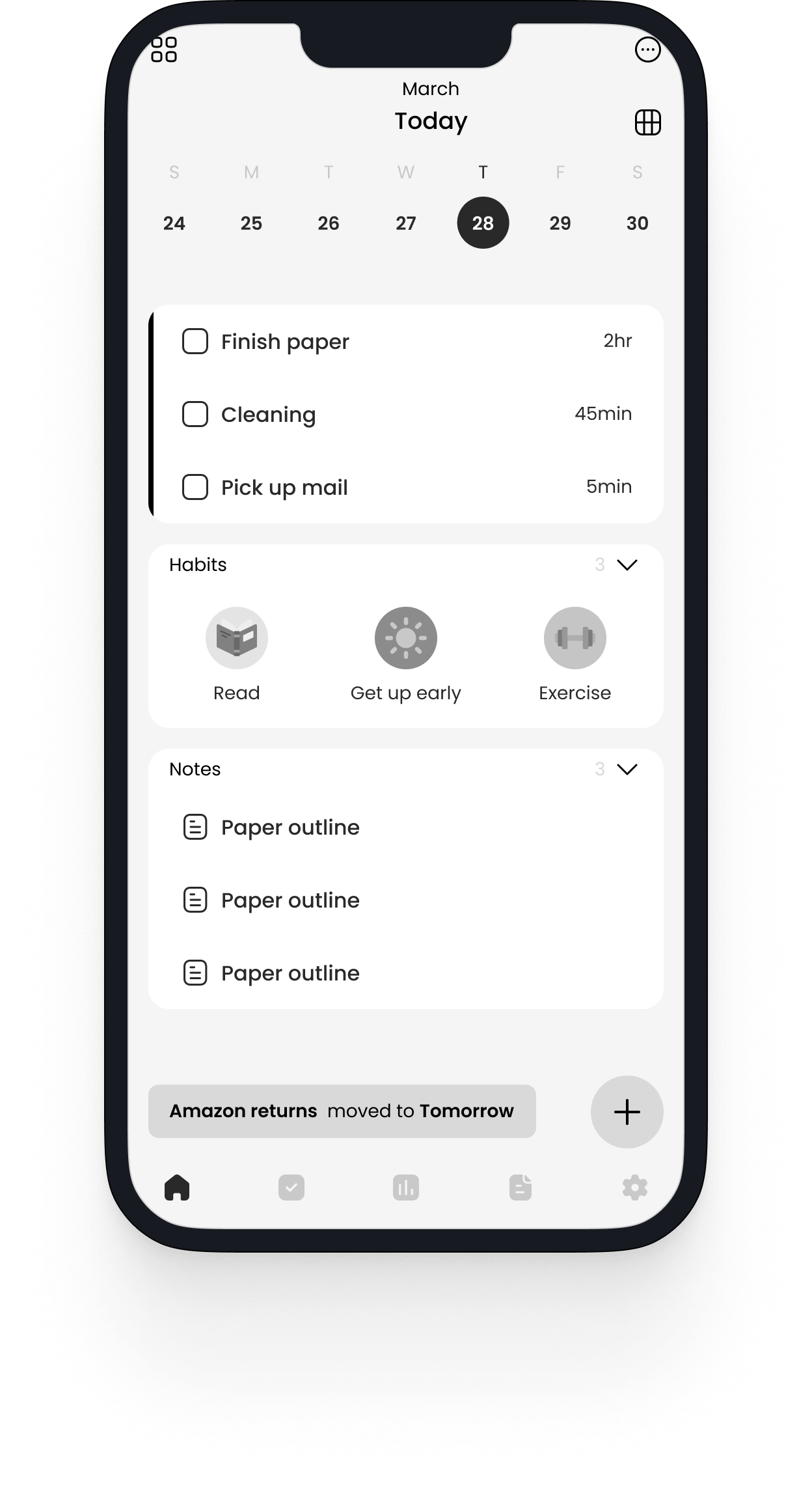
On the task page, users can find all of their to-dos for the day and easily view their progress. The colorful blob design provides a clear visual and adds a fun touch to completing tasks.
Create + Edit Tasks
The task design is optimized for touch interaction on mobile devices, and users have the option to easily customize reminders as well as add multiple “snoozes” so they don’t miss the notifications.
Add Reminders
Users can easily reschedule their tasks and notes to another day to accommodate any changes in their plans.
Reschedule Task
Finishing a task results in a fun animation that makes tackling the to-do list more enjoyable and rewarding.
Completion Animation
Results
Since this was a self-directed project, I was unable to get more extensive feedback and data. However, in a business setting I would monitor the following metrics to measure success:
Number of tasks, habits, and notes created would be the simplest measure to see if users actively engage with this app.
User Activity
Number of downloads and user satisfaction would be key indicators in the success of the app as well as important guides for future improvements.
User Satisfaction + NPS
Data about retention would reflect whether users integrate the app into their lives. Both customers that are retained and those who fall off provide valuable insights on future directions of improvement.
Customer Retention Rate
Future Possibilities + Ideas
Allow users to easily visualize their progress and access what they need without having to open the app. This could also include different design options based on what users want to focus on—tasks, habits, notes, etc.
Widgets
Allow users to prioritize their tasks and give them more visual prominence in the task screen so users can focus on what matters most.
Prioritization
Integrate with user’s choice of calendar so they can see and access all their events and tasks in the same place.
Integration
Final Thoughts
With the final updated prototype, I believe I have met the goals outlined at the beginning of the design process. If I had more time and resources, I would like to build out the notes and habits sections of the app as well as tackle some of the ideas mentioned above.
When starting this project, I set out to challenge myself to push the visual design and interactions—I’m really happy with the final result, and I thoroughly enjoyed working on it. Task and habit apps are something that I love, and it was fun to try to design one myself.

